Both these maps show the same segment of the southern United States, and demonstrate a similar pattern. Yet each describes a wholly other era and a completely different process.
The bottom map dates from 1860 (i.e. the eve of the Civil War), and indicates where cotton was produced at that time, each dot representing 2,000 bales of the stuff. Cotton was King back then, and mainly so in the densely cultivated border area between Louisiana and Mississippi, and in an equally dense band of cotton cultivation starting west of the Mississippi-Alabama line, tapering out across Alabama, Georgia and South Carolina. Other cotton centres are the areas around Memphis and what appears to be Lawrenceburg in southern Tennessee.
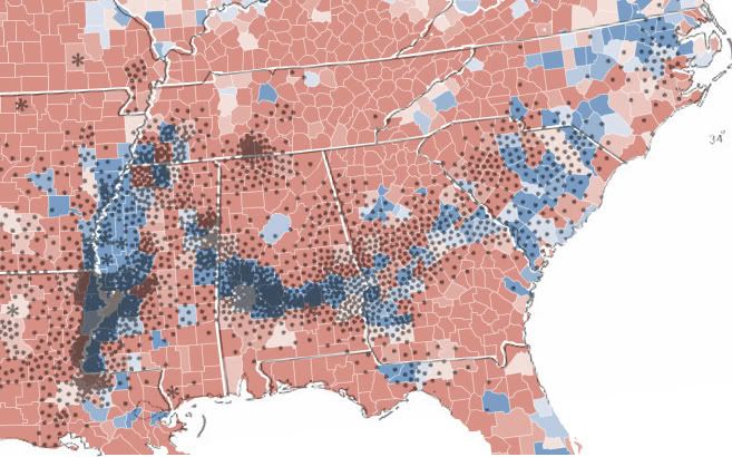
The top map dates from 2008, and shows the results of the recent presidential election, on county level. Blue counties voted for Obama, red ones for McCain (darker hues representing larger majorities). In spite of Obama’s national victory, and barring Virginia, North Carolina and Florida, all Southern states (i.e. all states formerly belonging to the Confederacy) went for McCain. The pattern of pro-Obama counties in those southern states corresponds strikingly with the cotton-picking areas of the 1860s, especially along the Louisiana-Mississippi and Mississippi-Alabama borders (the pattern corresponds less strikingly and deviates significantly elsewhere).
In a way, all this means is that the descendants of slave families voted overwhelmingly for Obama. Not exactly a surprise. But the map is still really striking, isn't it? Even nearly 150 years after the civil war, the racial/political demographics split in almost precisely the same way and, one could argue, for some of the same reasons.
The influence of our history on the present is crystal clear.
that map is very powerful. 150 years is a long time, but in terms of world history it's absolutely nothing. what a reminder of how the more things change, the more they remain the same in many parts & aspects of our nation
ReplyDeleteAmen to the power of this map. Talk about a picture saying 1000 words.
ReplyDelete