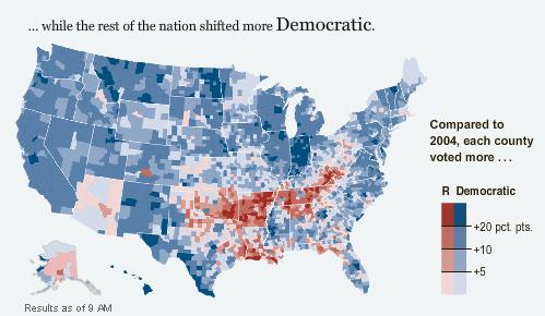
 The Red and Blue are the percentages they voted R or D compared to the 2004 election.
So they voted for Kerry, but for some reason they couldn't vote for Barack. Going door to door in southwestern VA a lifelong democrat told me that she just didn't think Barack would look out for "us" the same way John McCain would. Looking at this map it seems like she wasn't the only one who felt that way...
No comments:
Post a Comment